# Application Structure
Email Hero's user interface structure is standardized, you will encounter with the same patterns all around the application.
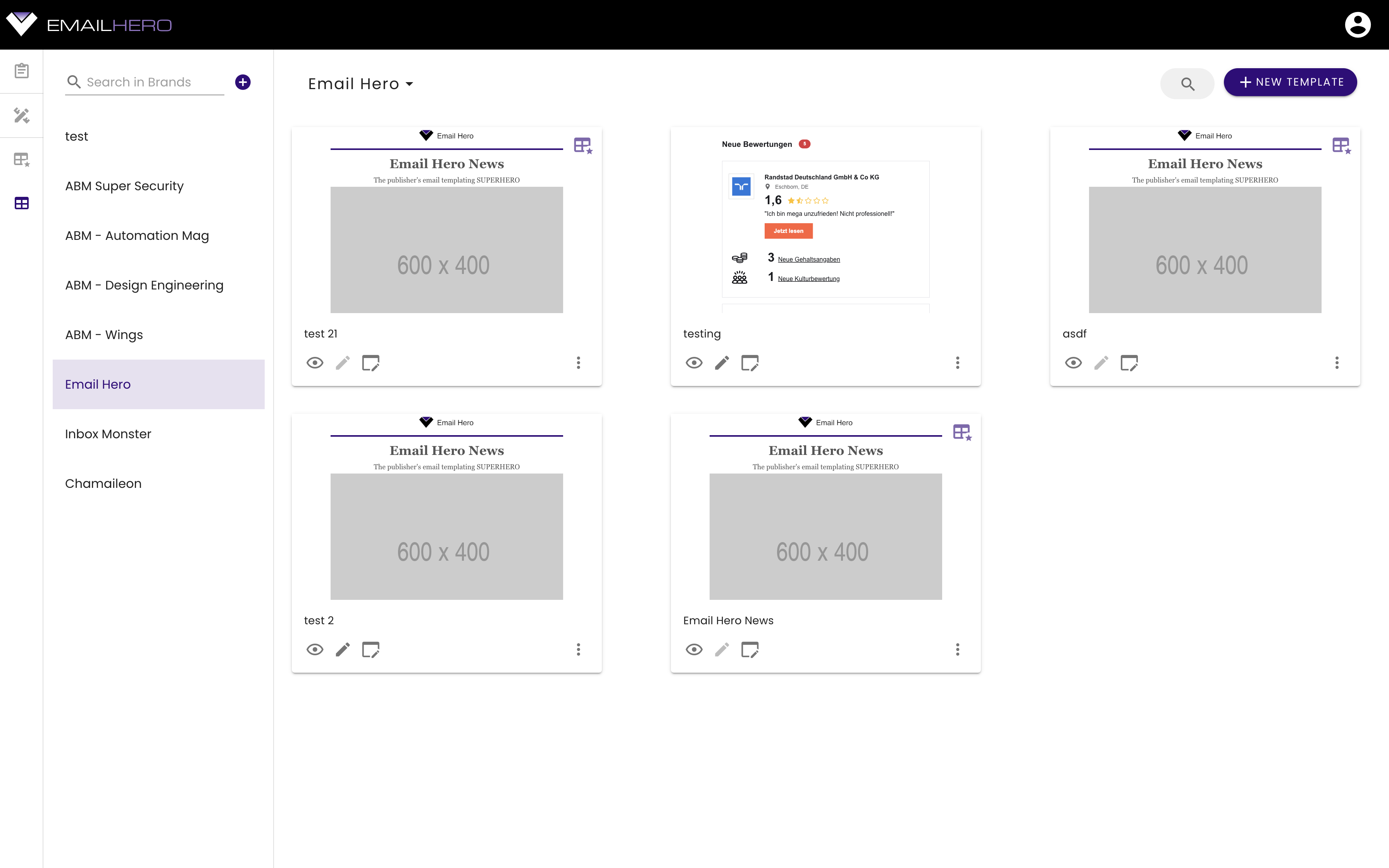
In the upcoming sections, we are going to walk through the main parts of the application. We are going to highlight the part we are talking about with a red border.
# Navigation sidebar
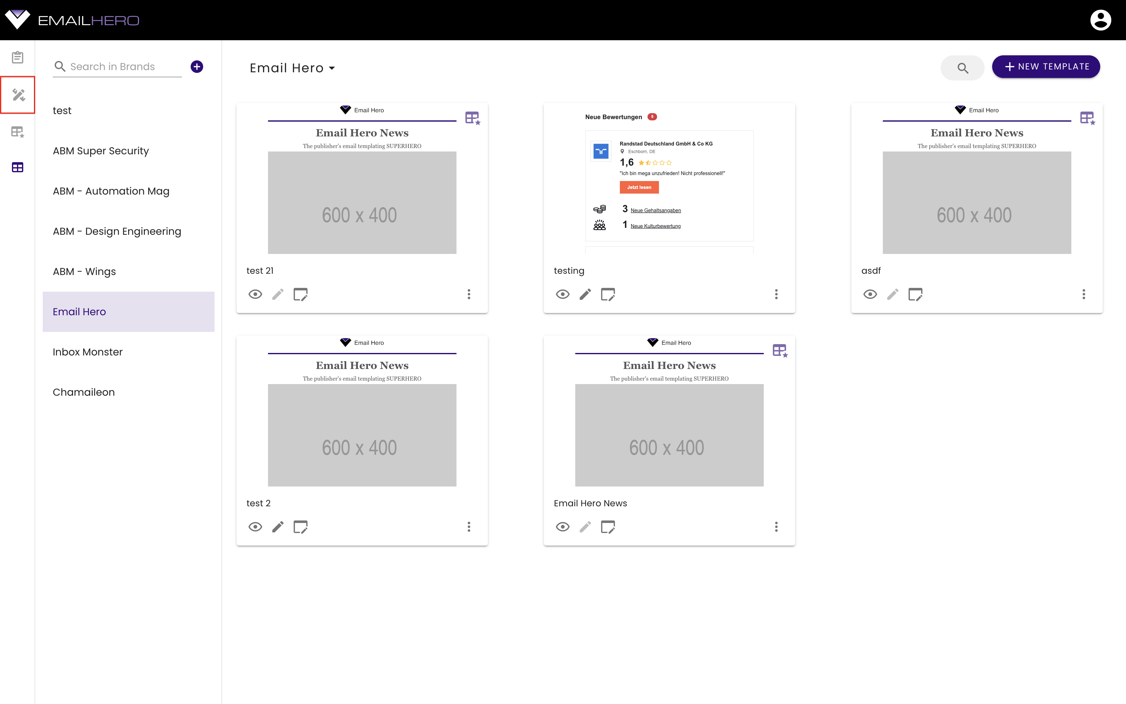
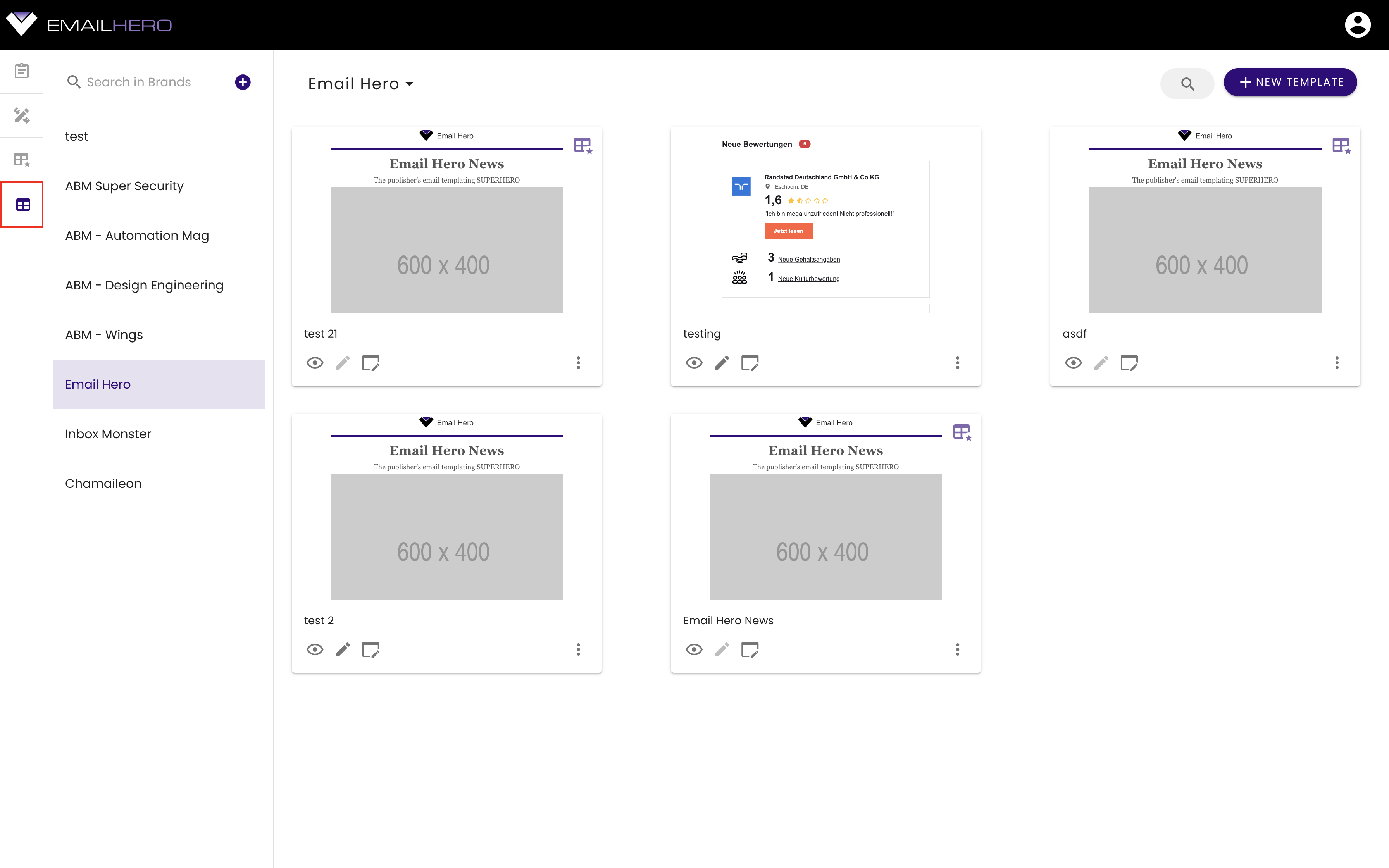
On the left hand side, you can see a permanent navigation sidebar. You can always switch to the application's main views from here.
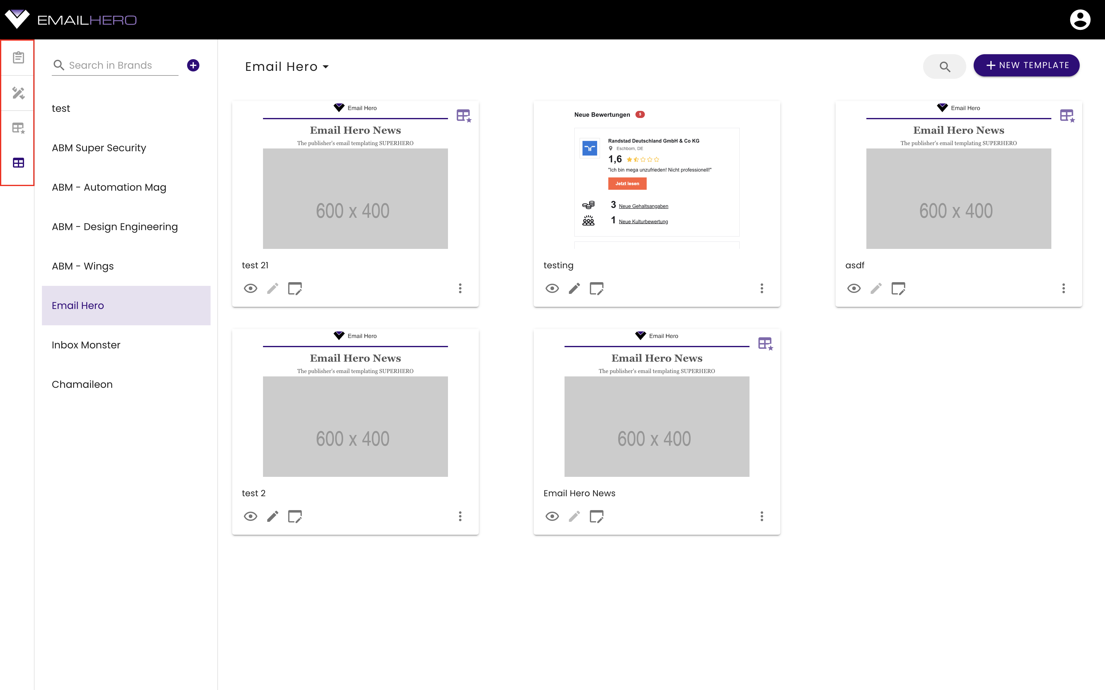
There are four items in this navigation bar.
# Navigation list
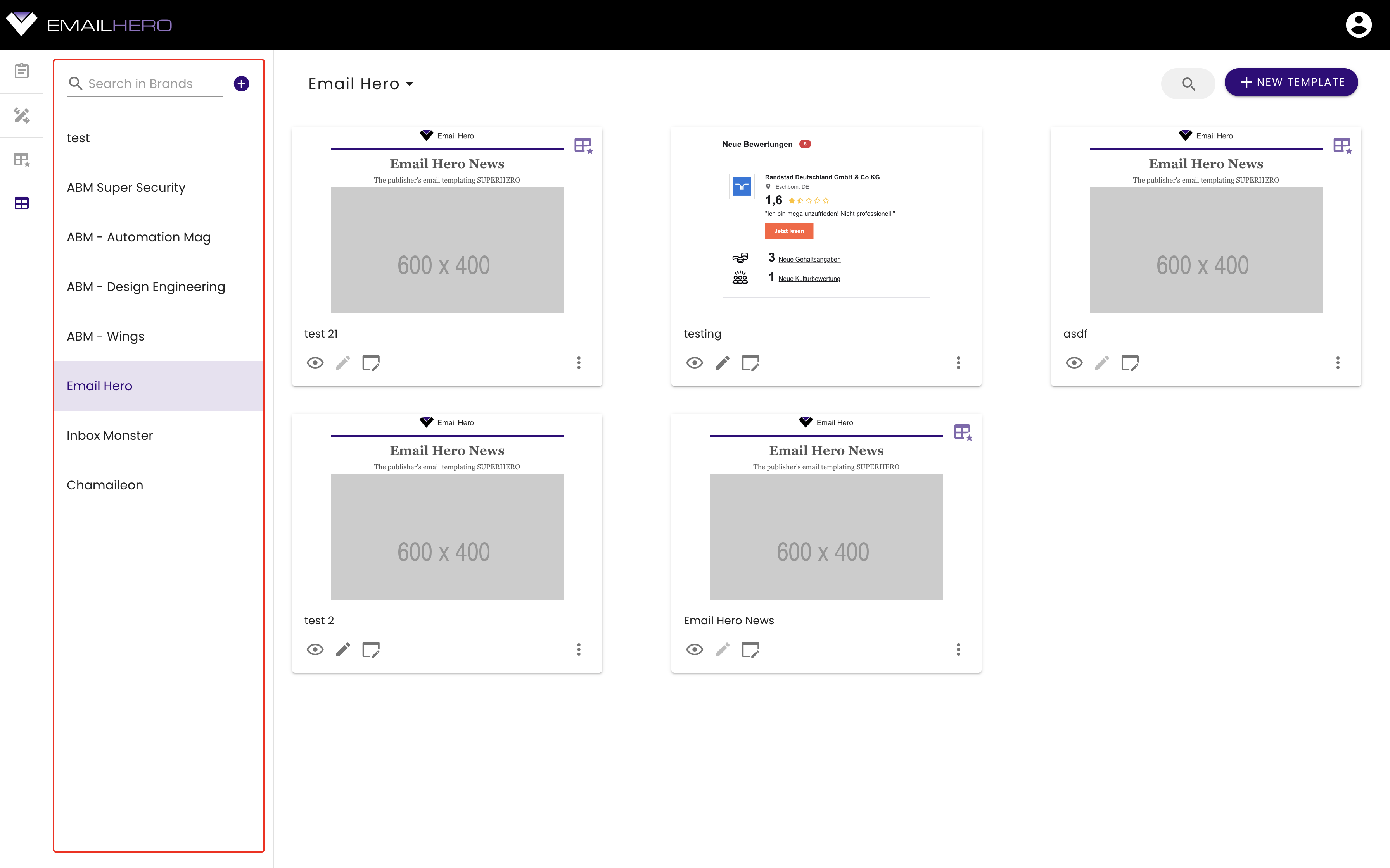
In the great majority of the views, you will see a navigation list on the right-hand side of the main navigation sidebar:
Side-note
In Email Hero, these navigation lists are used for managing:
- block categories
- master template categories
- and brands.
On the fop of the navigation list, you can find a search bar, with which you can search for the name of the list items:

You can also create a new item, by pressing the plus button next to the search bar:

# Selected list item
The selected item from the navigation list will appear on the top of the main part of the application:
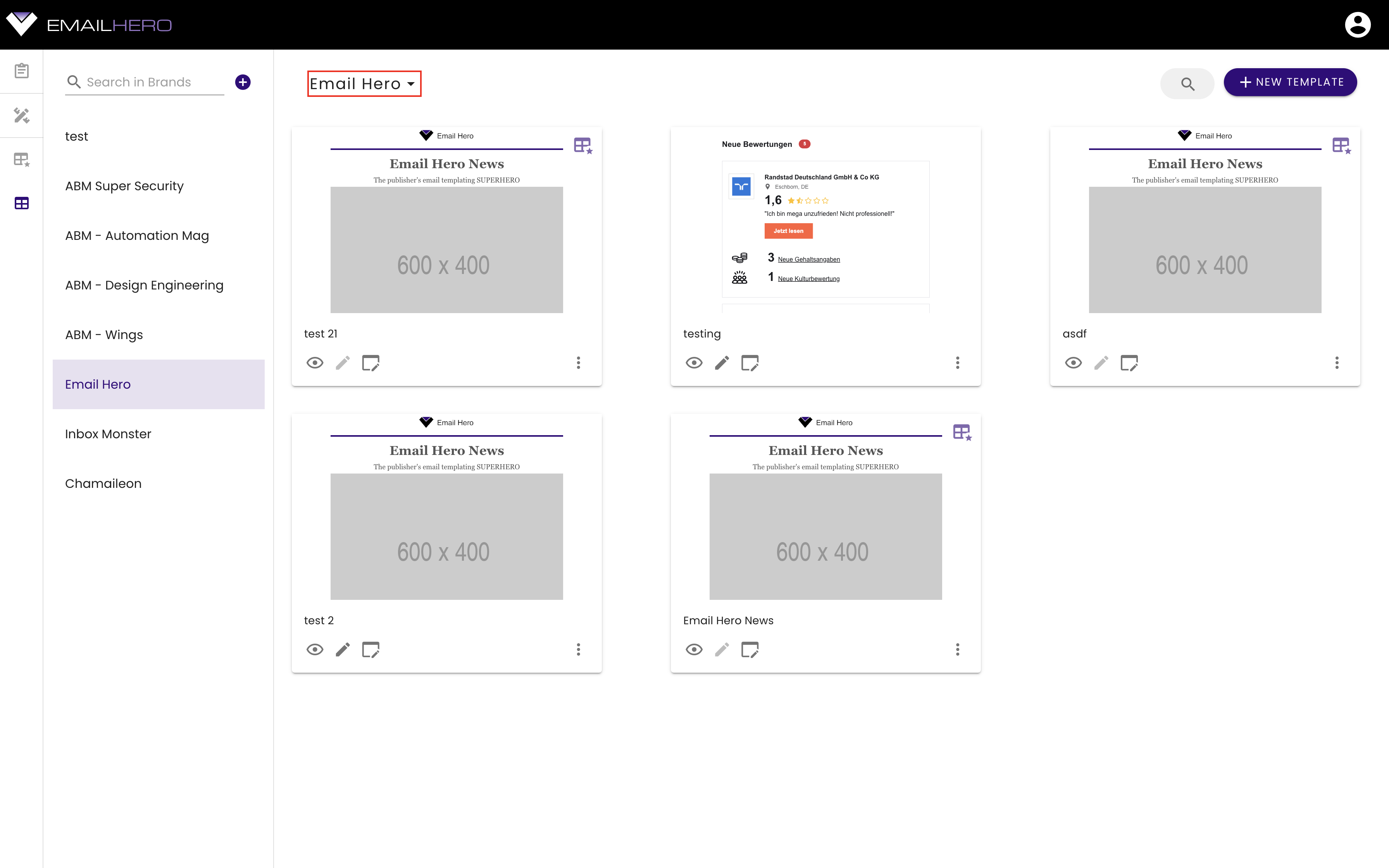
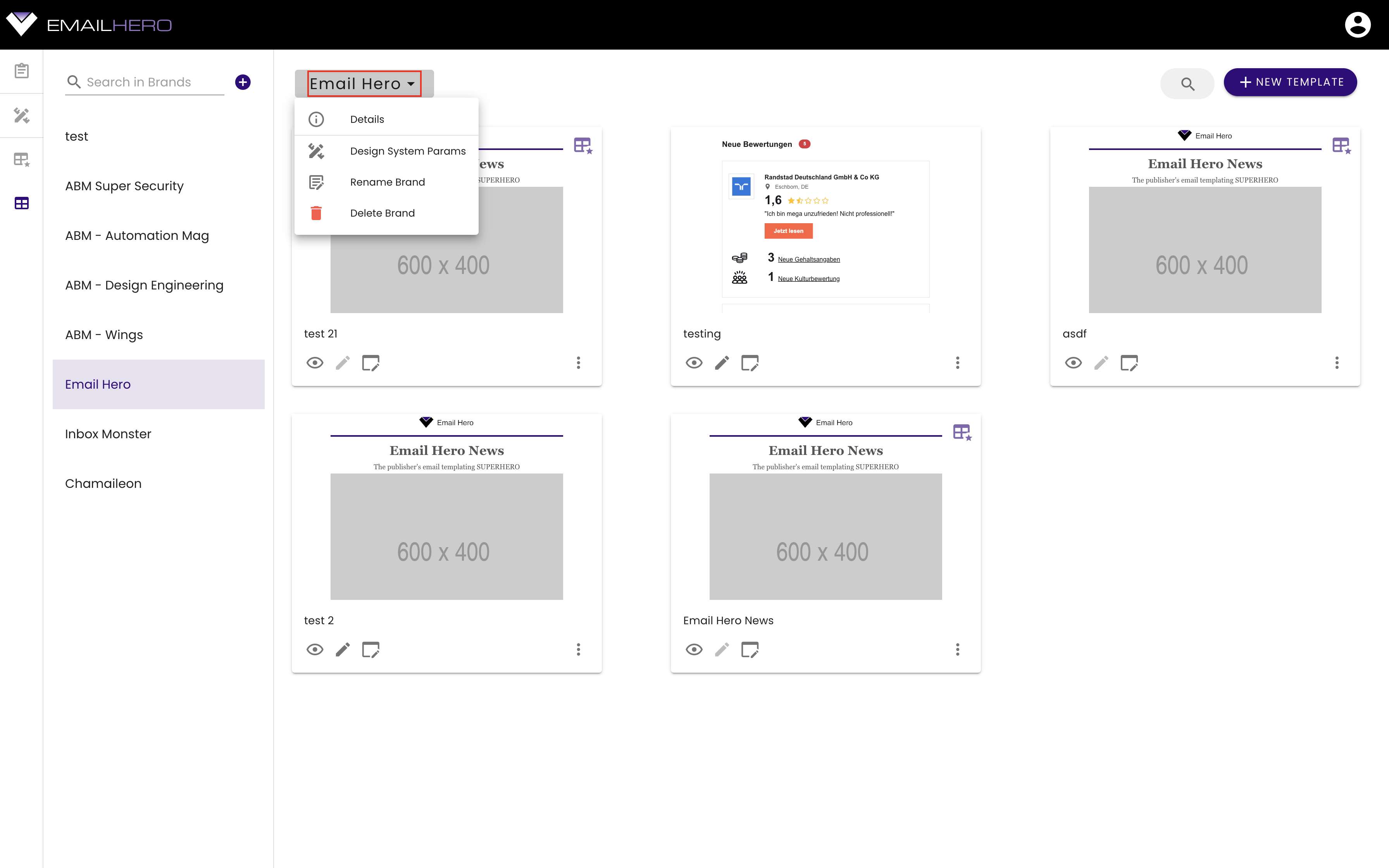
You can access the selected list item's actions through its dropdown menu:
# Item grid
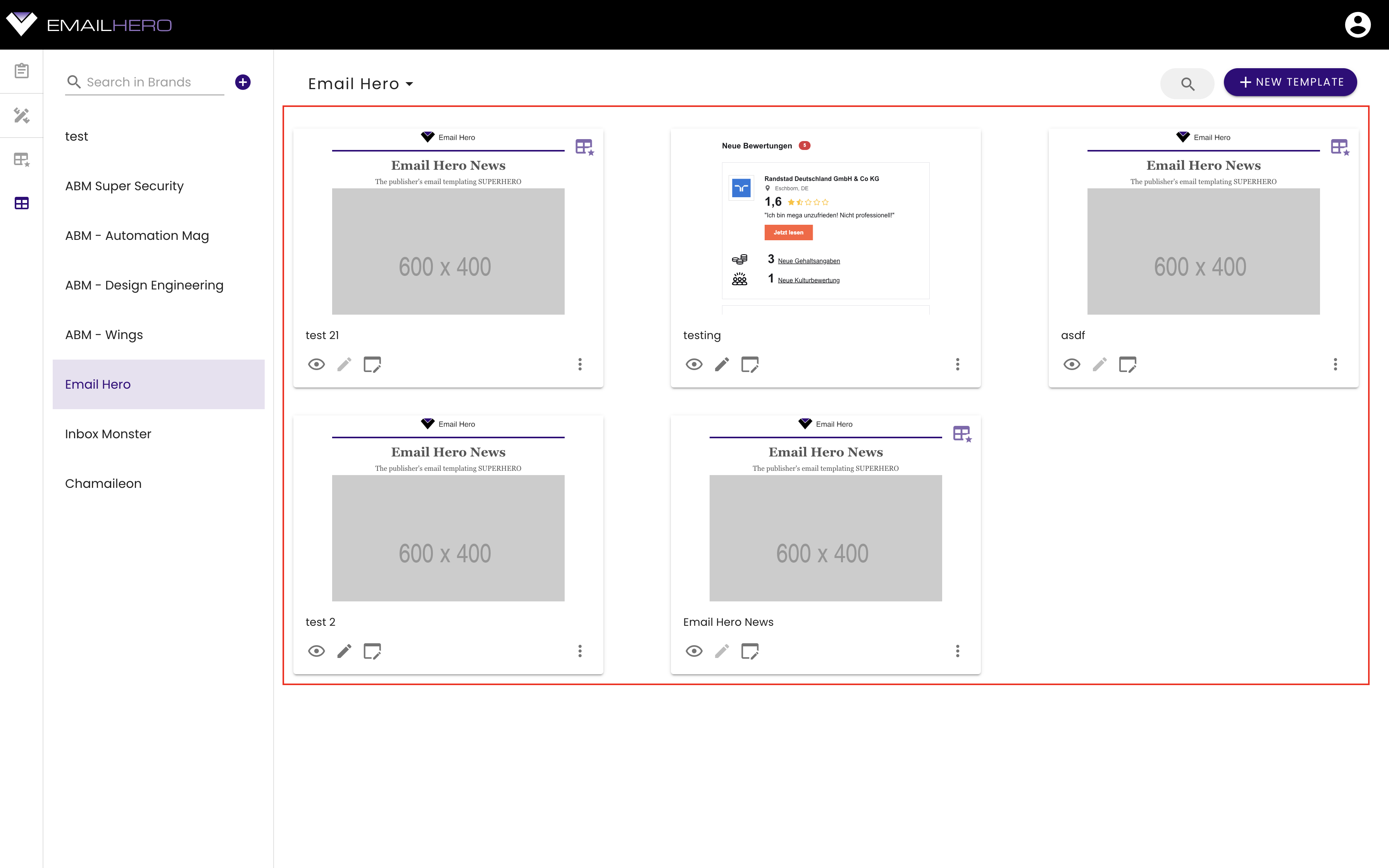
The main part of the application is an item grid. Each item is a card with different actions:
On the top of the item grid, you can find a search bar:
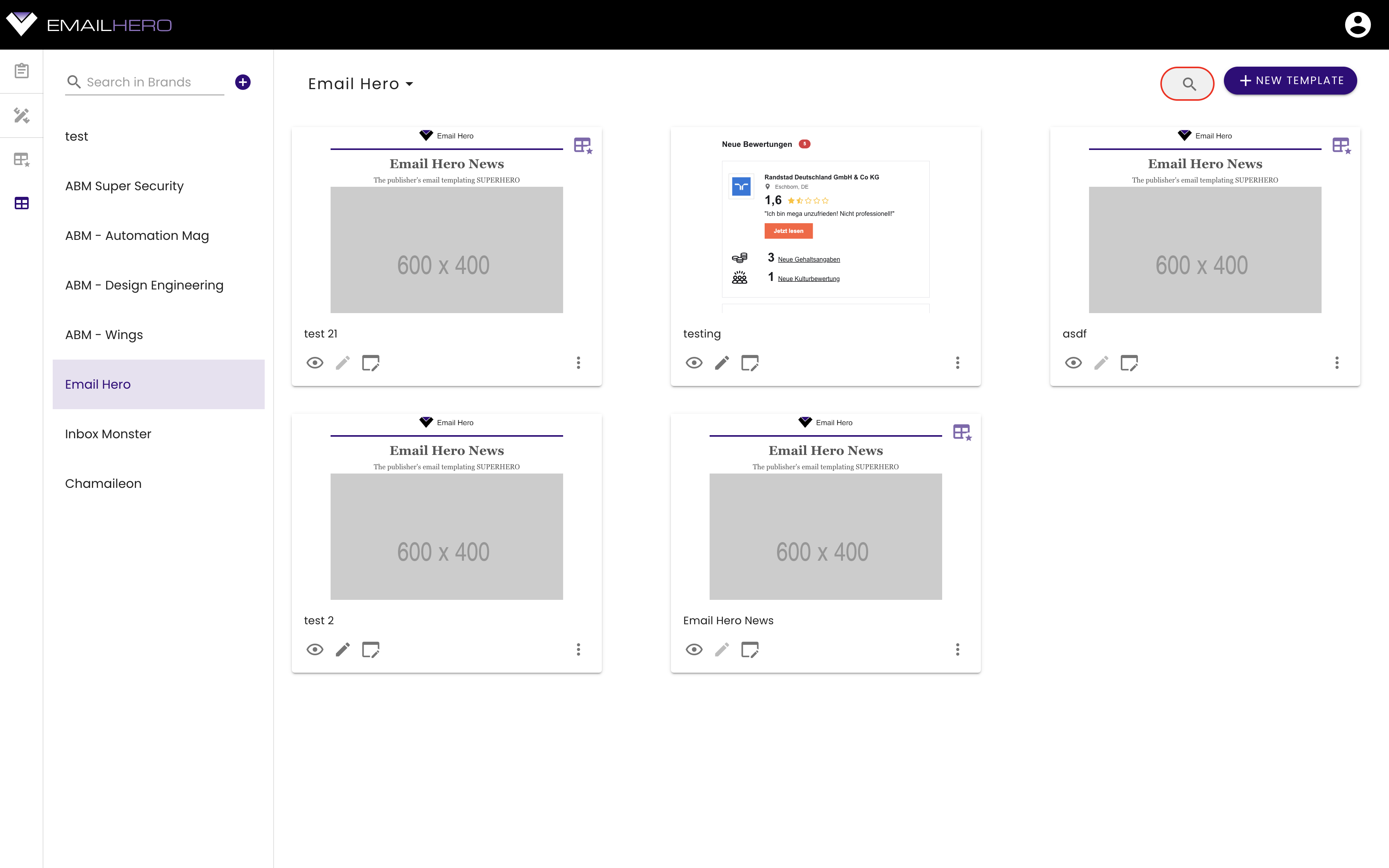
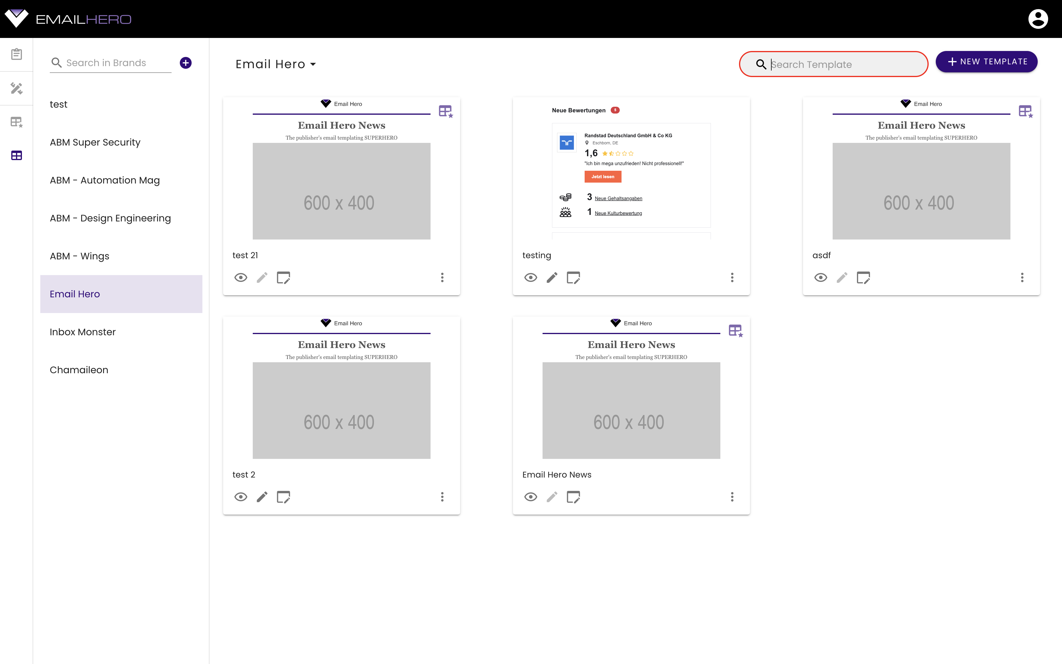
That is extending when you click on it. You can search for the items in the currently selected category. (These are blocks, master templates, or brand templates.)
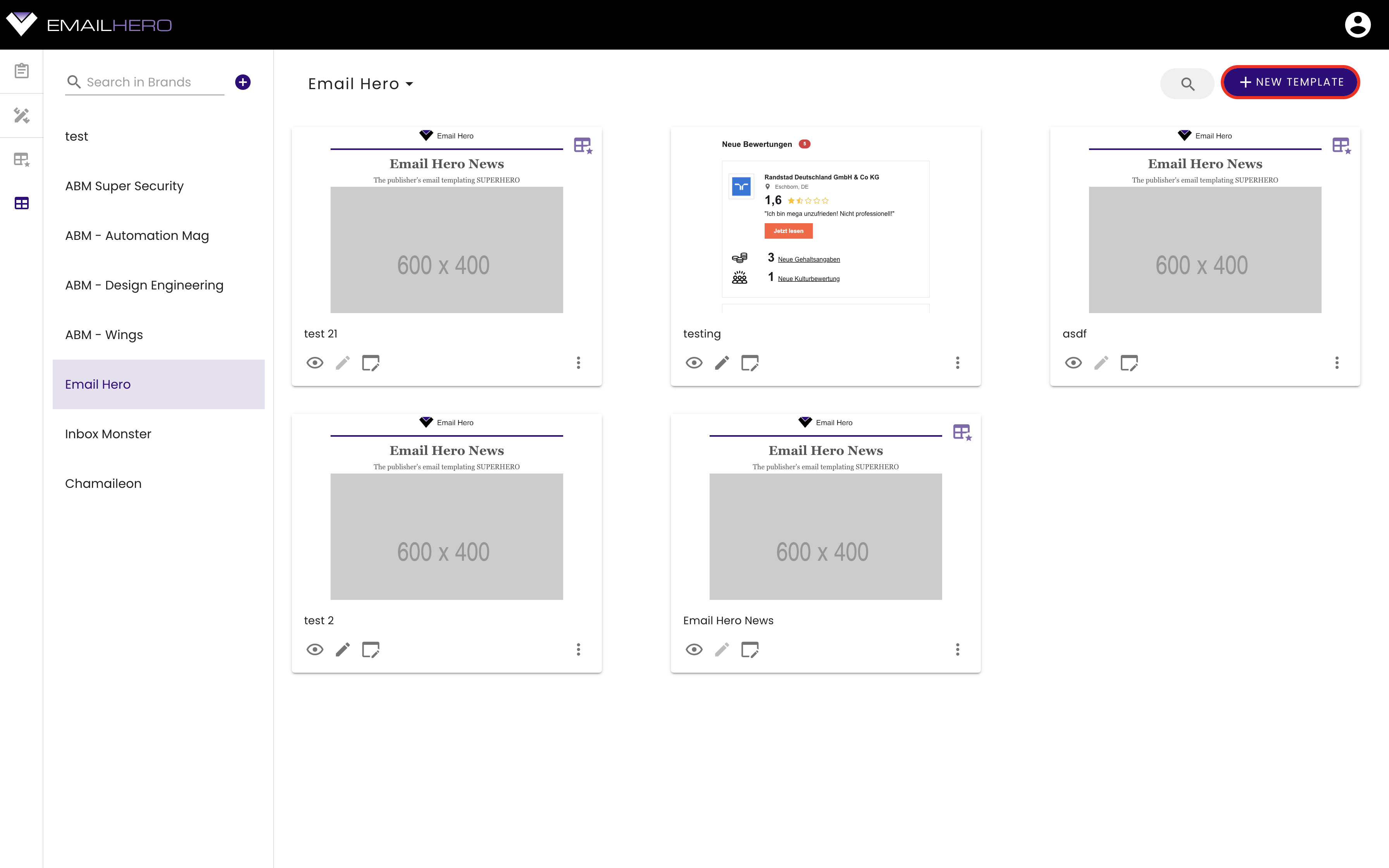
You can also add a new item by clicking the button on the top-right-hand-side corner:
